Soap Challenge Club: Butterfly Swirl

Butterfly Swirl Entry

I haven’t participated in the Soap Challenge Club in a long time. I really wanted a chance to try out the Butterfly Swirl, perfected (maybe invented?) by Zahida of Handmade in Florida. I don’t have a deep mold like Zahida, but the beauty of the Butterfly Swirl is that you can get pretty decent results even with a regular mold like mine.

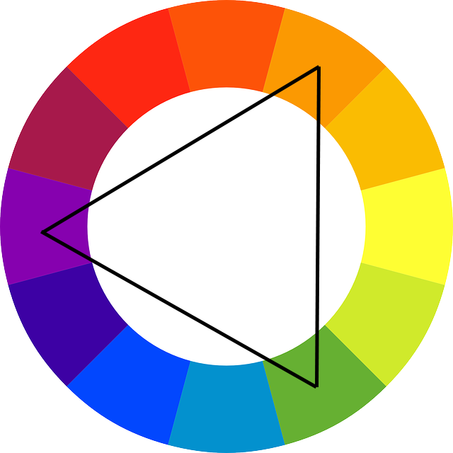
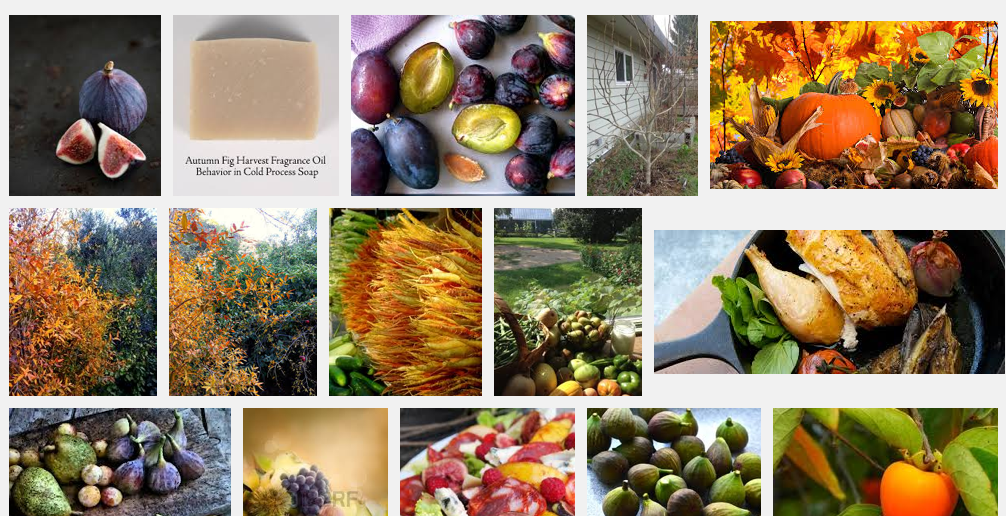
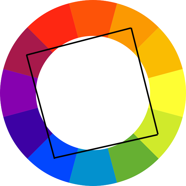
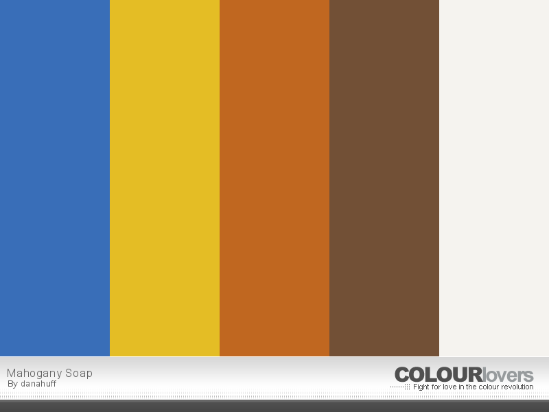
When I participated in the S.O.A.P. Panel last year, I tested a fragrance called Mahogany. I said at the time that it reminded me of a sexy man. You can read my thoughts about that fragrance here and here. I loved the way it smelled. I have been wanting to make a soap with a color palette similar to this:

COLOURlovers.com-Mahogany_Soap

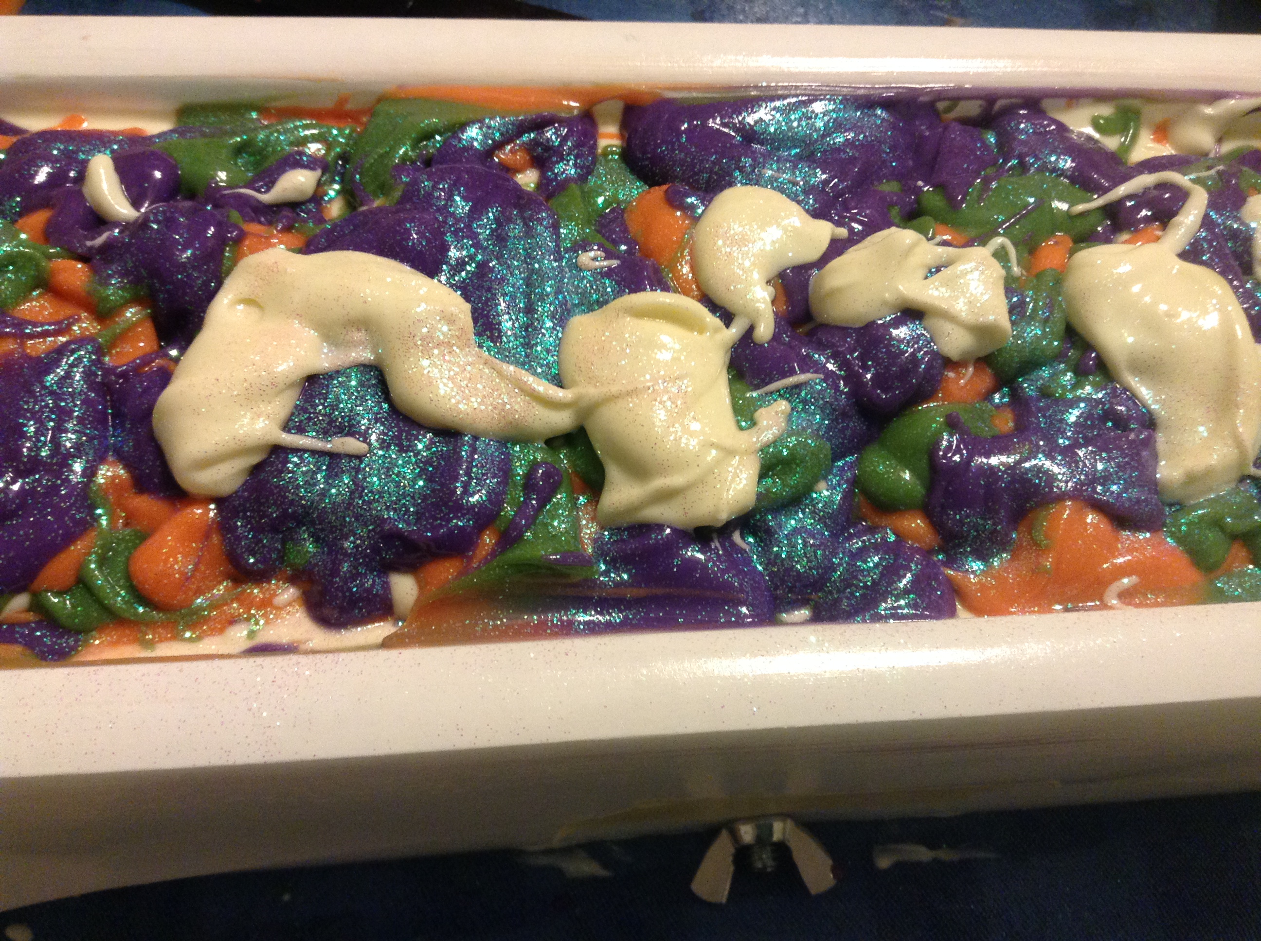
I knew I wanted to use Nurture mica. I have the Vibrance mica set and the Pastels mica set. I previously used the 24 Karat Gold mica from Rustic Escentuals in my Inspiration Soap Challenge. Even in cold process soap, it retains a lot of its sparkle. I hadn’t tried Bramble Berry’s Copper Sparkle mica, but after a quick check to see that it was safe for use in cold process, I decided to try it. I ordered it some time ago as part of a sample pack. I have used Bramble Berry’s Cappuccino mica in several soaps in the past. I love the rich brown shade. My palette hasn’t captured the exact tones of the micas, but it’s close.

I recall hearing Celine say in one of her videos that one color that really pulls a soap together is white. I think she’s right about that. Even if it’s just a little bit of white, it really seems to bring out the design. So, in addition to the four mica colors, I also used a little bit of titanium dioxide to produce a cream color in my soap.

I decided to call the soap “Sexy Man Soap” after my first reaction to smelling the fragrance. Here is a video of the making of the soap:

I really enjoyed the entire process of making this soap. The colors are a lot of fun to work with, and the fragrance is delicious. I’m going to have to order more of it.

The more I work with micas, the more I fall in love with them. I used mainly oxides and ultramarines in the past, but micas have such beautiful hues, and even if their sparkle doesn’t always come through in cold process soap, they’re still lovely to work with.

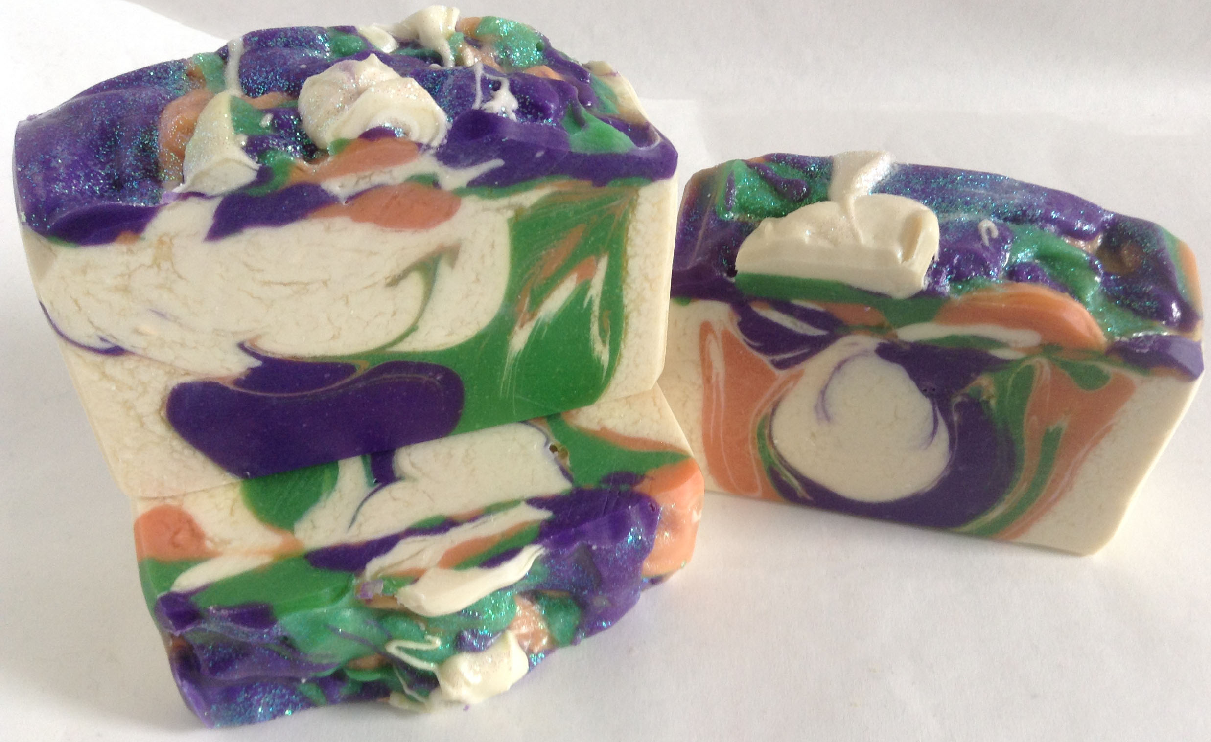
This technique is interesting because it’s hard to tell if what you’re doing will result in a butterfly shape in the soap. I knew that working with a flatter mold like mine would give me less room to get the shape I wanted, and I was quite pleasantly surprised when I cut the soap and found several bars did indeed have a butterfly shape.

Butterfly Swirl

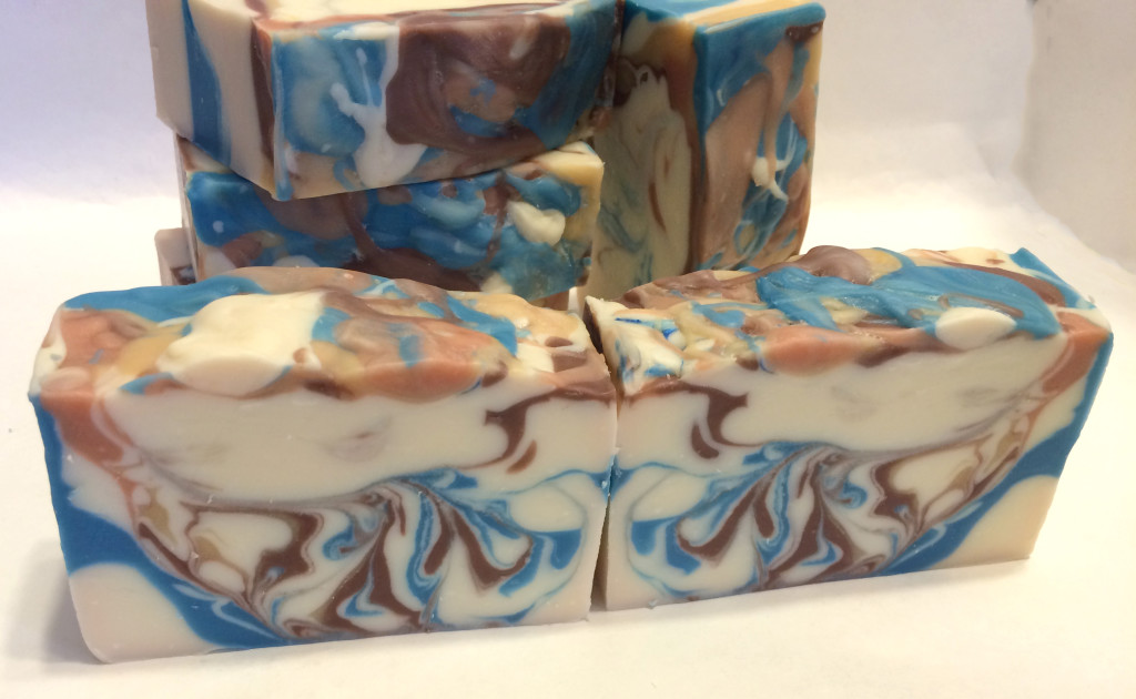
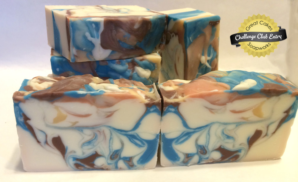
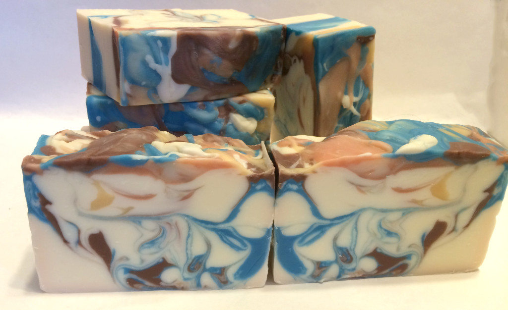
This first set has a lighter top, but I can make out the shape of wings.

Butterfly Swirl

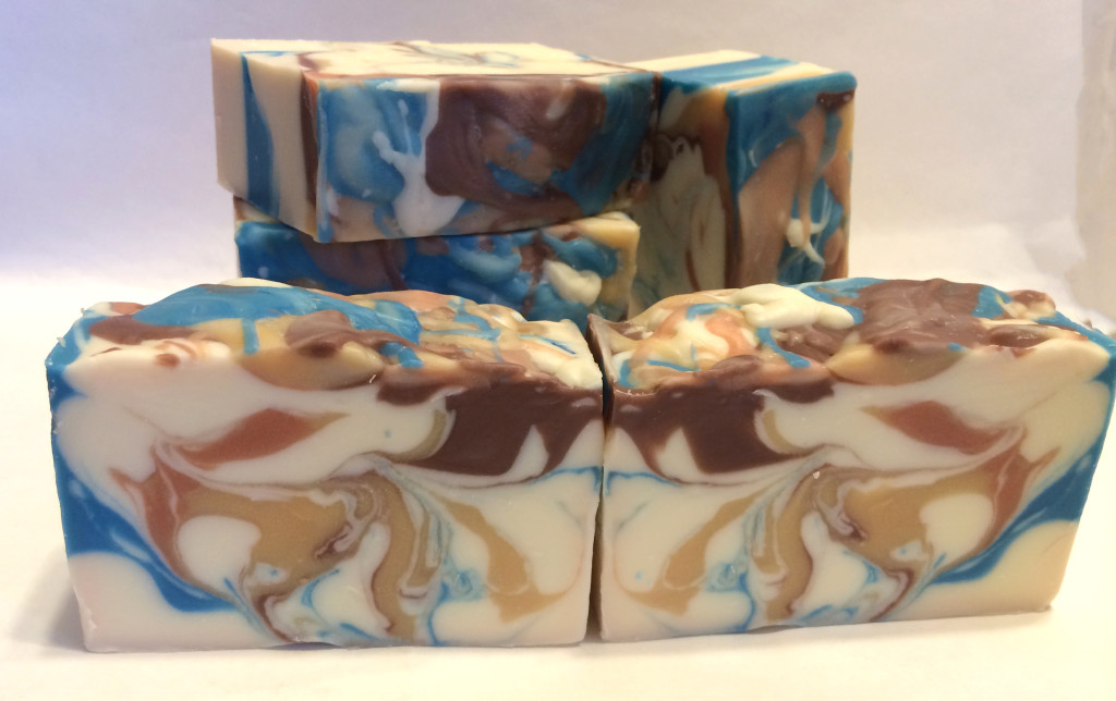
This second set has a nice shape, and more of the gold and brown show through. The blue is the outline of the wings.

Butterfly Swirl

I thought this third set of soaps made the best butterfly. The brown accents look like the edges of wings, and the blue where the soaps join looks like a butterfly body. The splatter tops look like the tops of butterfly wings. It is this last picture that I will enter for the challenge contest. Don’t you just love that Blue Vibrance mica?

I’m happy with how these came out. I made them for my husband Steve, and he’s claiming three, but he says I can sell the rest of them in the shop. Look for them in time for Valentine’s Day, in case you want to get some for your own sexy man.

You know what? It felt pretty good to make a video again after a long hiatus, too.

Soaping on the Color Wheel

Some time back, I blogged about color theory as it related to selecting colors for soapmaking. In that post, I discussed that one way to create an appealing color combination is to use complementary colors, or colors that oppose each other on the color wheel.

Color Wheel
Color Wheel via Wikipedia

You can see that purple and yellow directly oppose each other on the color wheel. However, orange and green also oppose purple on the color wheel and form a triangulation of complementary colors. In between purple and green (the darker green), there are three colors, and in between purple and orange (the lighter orange), there are likewise three colors. There are again three colors between orange and green. These sorts of triangulations are also worth considering when you are thinking about color combinations.

Color Wheel TriangulationThis sounds interesting in theory, but in practice, how do these colors look together in soap?

I recently made a batch of Autumn Fig Harvest, with a new fragrance from Bramble Berry (which I tested as part of the S.O.A.P. Panel). One of the first things I do if I am not sure what kind of color combination I might want to try is look for images using Google Image Search. I simply Googled the fragrance oil name, and this is the set of images that I could see (screen-captured because of the changing nature of the Internet):

Screen Shot of Google Image SearchThe images in the top and middle rows caught my eye. The first two images in row one are straight from Bramble Berry’s site. The third image, however, comes from a cooking blog called Figs, Bay & Wine. Notice the green and purple in the plums. As I said in my earlier post about color theory, turning to nature for color combinations is often a good idea because nature understands color theory. Finding that picture was a lucky accident because I was not searching for plums at all. Skipping over the fourth picture, notice the third image is a pumpkin in a fall setting. My eye was drawn to how these colors looked next to each other: purple, green, and orange. Even though those colors (with the exception perhaps of purple) have little to do with figs, I knew I had found the color combination I wanted to use.

Celine Blacow has said in her soapmaking videos that using white is often what brings a color combination together. I have noticed the difference white makes in pulling together the look of a soap. It’s not always necessary, but it often does make a huge difference in the soap’s design. So, a field of white would be important in pulling together a design with purple, orange, and green. I thought the three colors would have an autumnal look as well.

Purple can be tricky in soap if you just use oxides, but I had recently purchased a set of Vibrance Micas from Nurture Soap Supplies. I used the Vibrance Purple and Green micas, and I probably could have used the Vibrance Orange from this set as well, but elected to use Clementine Pop Mica from Rustic Escentuals. I had used it before, and I knew it would make a nice pumpkin shade in the soap.

Here is what the soap looked like in the mold.

Autumn Fig Harvest in the moldFirst I poured in a layer of white, then I did a drop swirl with each of the other three colors. I decided to try the spatter-top technique (a sort of Jackson Pollock effect). Just like using white, I have found that a bit of glitter also adds something extra special to soap.

Here is what the soap looks like cut:

Autumn Fig HarvestYou will notice I have a bit of titanium dioxide crackle, also known as glycerine rivers, in the soap in the white parts. There are many intriguing theories about what causes them—the most recent interesting one I came across is the amount of water used in the lye solution—but frankly, I haven’t been able to figure out why they happen sometimes and don’t other times. I believe them to be the result of heat because when I do not gel my soaps, I never have them. However, gelling soaps produces more vibrant colors and allows soaps to be cut and eventually used earlier than non-gelled soaps, and when I can, I try to gel them. Actually, the TD crackle is an interesting look. I’m sure other soapmakers see these soaps and think of them as mistakes, but the sort of antique look of TD crackle can lend interest (of course, that’s also just my opinion, and I’ve stopped trying to fight it).

The colors do look nice together. They make a bold statement, perhaps because they are triangulating colors. Try moving the triangle around the color wheel to come up with other bold combinations: red, yellow, and blue; violet-red (cranberry), orange-yellow, and light blue. In each case, the combination is a striking mix of complementary colors.

Another combination of colors to try is the square.

Square PaletteAgain, a striking combination of colors. In the example above, orange, yellow-green (lime), blue, and violet-red (cranberry). Each of the colors is two apart, which sets them off a little more than analogous colors (think red, yellow, and orange as analogous) would do. Try moving the square around the wheel to create other combinations.

Playing with color combinations using the color wheel can help you create appealing soap color combinations. Have you used the color wheel in your soaping creations? What were the results? How do you decide what colors to use? Chime in the comments!