When selecting colors for soapmaking, consideration of color theory as it applies to design might help you achieve the design results you want. Color theory is the notion that certain colors complement one another and make for a more pleasing design. A practical example of complementary colors can be seen in Vincent Van Gogh’s famous painting, The Starry Night. 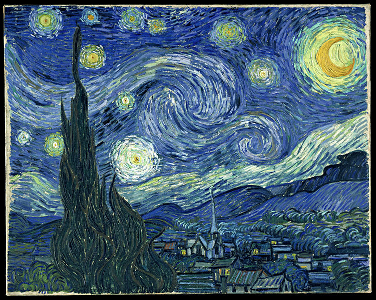 The cool blues complement the warm yellows of the stars, but the fresh greens also look beautiful with the cool blues. Van Gogh wrote to Anthon van Rappard:
[T]he great question occupied me—colour. I mean the breaking of the colours, red with green, blue with orange, yellow with violet. Always how the complementary colours go together, their influence on each other. Of which nature is as full as of light and shade.
Yet another letter to his brother Theo dated October 20, 1885 shows how deeply Van Gogh was thinking about color. That whole letter is worth reading if you are interested in color theory. We are drawn to color schemes based on how well the colors work with one another. In the color wheel below, warmer colors, like reds, oranges, and yellows, appear on the top, while cool colors like greens, blues, and purples appear on the bottom.

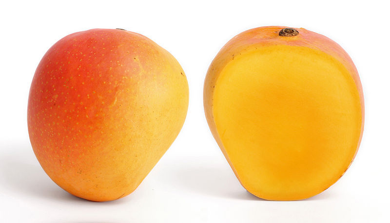
Complementary colors oppose each other on the color wheel. For example, notice that red and green oppose each other on the color wheel. They are often thrown together, particularly as Christmas colors. Blue and orange also oppose one another, as do yellow and purple. Let’s take one of these pairs and look at it in nature:

Nature seems to know well which colors will complement one another. Can’t you picture the yellow, purple, and green, perhaps with some white added in for contrast, in a gorgeous soap? In fact, one thing I often do when designing a soap is turn to nature photographs for inspiration. Another color scheme that often works well is to use analogous colors together. Analogous colors are those colors that are adjacent to each other on the color wheel. For example, red, orange, and yellow are analogous warm colors. Combining these colors together might evoke images such as fire or even summer fruits. However, colors look very different when they are placed next to other neutral colors, such as black or white. What might that fiery combination of red, orange, and yellow look like with a swirl of black woven through it? What about white? Here is a soap in which I tried a combination of the warm colors of red and orange with white.

One soapmaker who really gets this concept is Celine Blacow of iamhandmade.com. I have watched her videos for over a year now, and I have never seen her pick colors that do not go well together. Any soapmaker who is interested in learning to use colors well should definitely check out her work. Celine often uses a bit of white to great effect in her soaps. She said recently, and I confess I can’t recall in which video, that she adds white to set off the colors. Even a little pop of white can make a huge difference in the look of the soap. In his letter to Theo (linked above), Vincent Van Gogh said:
No—black and white, they have their reason and significance, and anyone who suppresses them won’t get it right. The most logical, certainly, is to regard them both as—neutral.
I recently made Mango Papaya Soap, and in selecting the colors, I turned to photographs of mangoes and papayas.
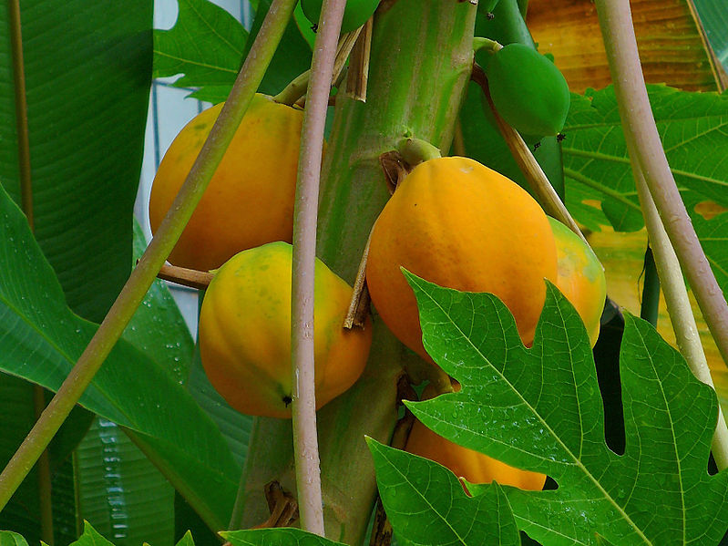
The colors that jumped out me were the oranges, yellows, and greens of the leaves. While there is no white in the fruits themselves, notice that the backgrounds include white, so I decided that when I colored my soap, I’d use white to make these other colors pop. 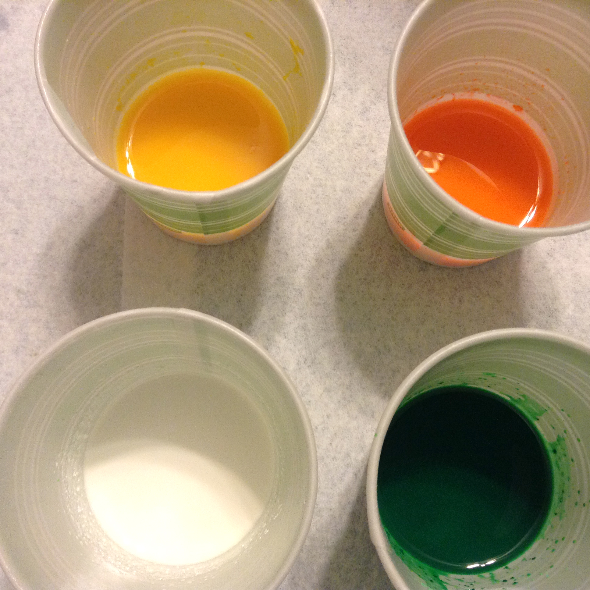 Here is the soap that resulted.
 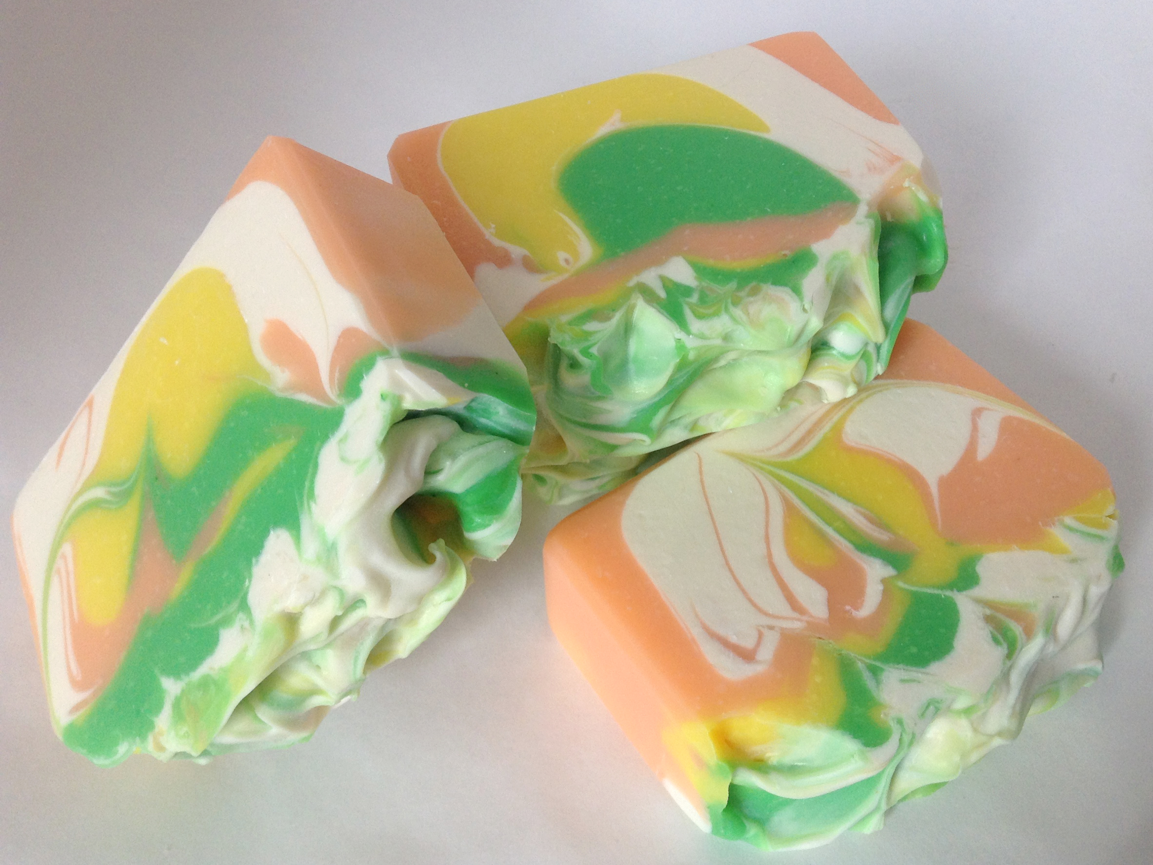 The colors hearken back to the nature photos of mangoes and papayas. If I make it again, I’ll use less green and more orange, but I’m happy with the results, and the colors work well with the mango papaya fragrance I used. I am not sure this soap would be as nice without the white. Colors used in this soap are titanium dioxide, Bramble Berry’s Fizzy Lemonade and Tangerine Wow pigments, and TKB’s Reformulated Neon Green.
Great blog post Dana! Understanding color theory is something that I really would like to work on, so thanks for sharing this!
Cee recently posted..Versatile Blogger Nomination
Thanks, Cee. You do a great job with color!
Hi,
I'm new in the cold process and have found your website amazing, with
plenty of recipes and new gr8 ideias. I'll share it in my blog. And please
feel free to visit my online store of Soaps from Brazil at:
http://loja.fabricadearomas.com.br
Thank you, Ricardo!