Matching Colors with Fragrances

I decided to use the last of my S.O.A.P. Panel freebies, Mandarin Oasis. I didn’t test this fragrance on the S.O.A.P. Panel—it was not one of my eight fragrances, but it was one of the fragrances tested by the second panel last year. Testers received two ounces of each of the fragrances that were ultimately selected for sale.

Bramble Berry describes the fragrance as follows:

This fragrance smells great for both kids and adults! Similar to Energy, one of our top selling fragrance oils, Mandarin Oasis has a sweet orange top note but with a sophisticated undertone. Mid-notes of papaya, ginger and thyme really hold this fragrance together giving it a sweet and sultry aroma. Crisp notes of cotton, teakwood, and neroli make this fragrance extremely versatile for projects ranging from personal perfume, laundry soap, or sugar scrubs. Take your senses on a mini-vacation!

I don’t smell the similarity to Energy myself, but I do smell the sweet notes in the fragrance. I’m not sure I pick out a mandarin orange scent. It doesn’t smell spicy to me at all. I think I do detect the neroli. My nose is not the most sophisticated in terms of making distinctions among all the layers in a fragrance. However, Mandarin Oasis does smell absolutely gorgeous. It’s very feminine.

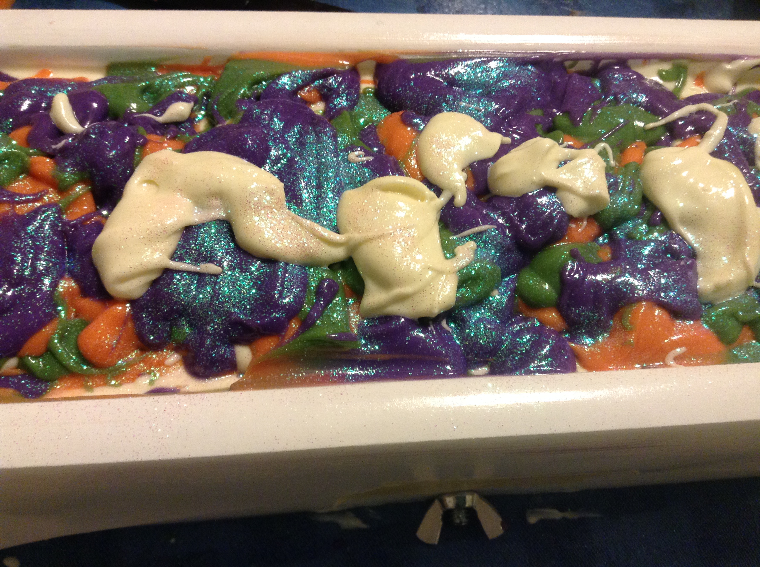
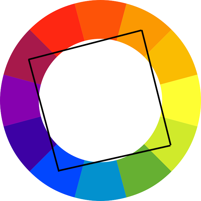
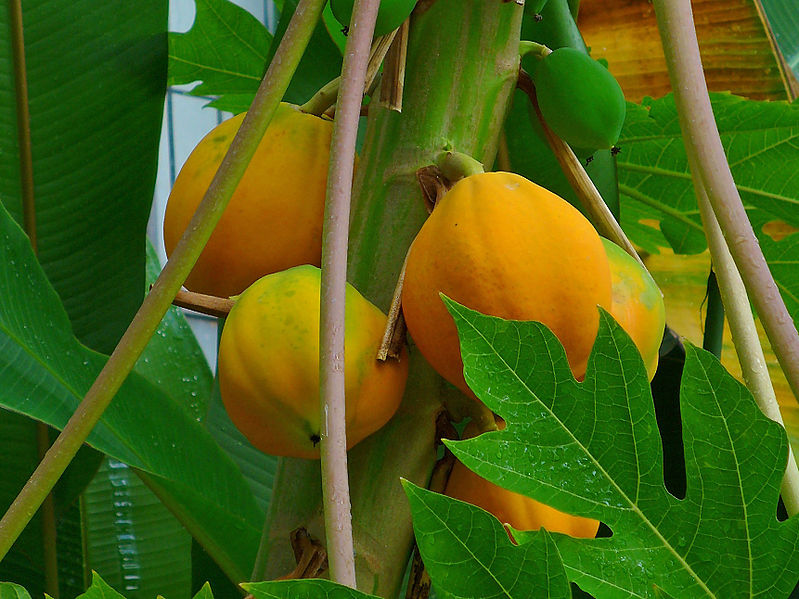
I’ve written before about using the color wheel to create soap designs. But I don’t use the color wheel alone when thinking about which colors to use. I also think about what colors match the fragrance. When I think mandarin, the first color that comes to mind is orange. I toyed with the idea of an orange, black, and white color scheme for this fragrance, but the more I thought about it, the more I didn’t think it fit this particular fragrance. I think quite a lot about colors that match the fragrances I use. The image Bramble Berry attaches to this fragrance is black palm trees at sunset. It’s pretty, but it doesn’t quite evoke the fragrance for me either. It seems a little too dark. However, it did give me an idea. What about using sunset colors?

Sunset
Photo credit: Luis Medina

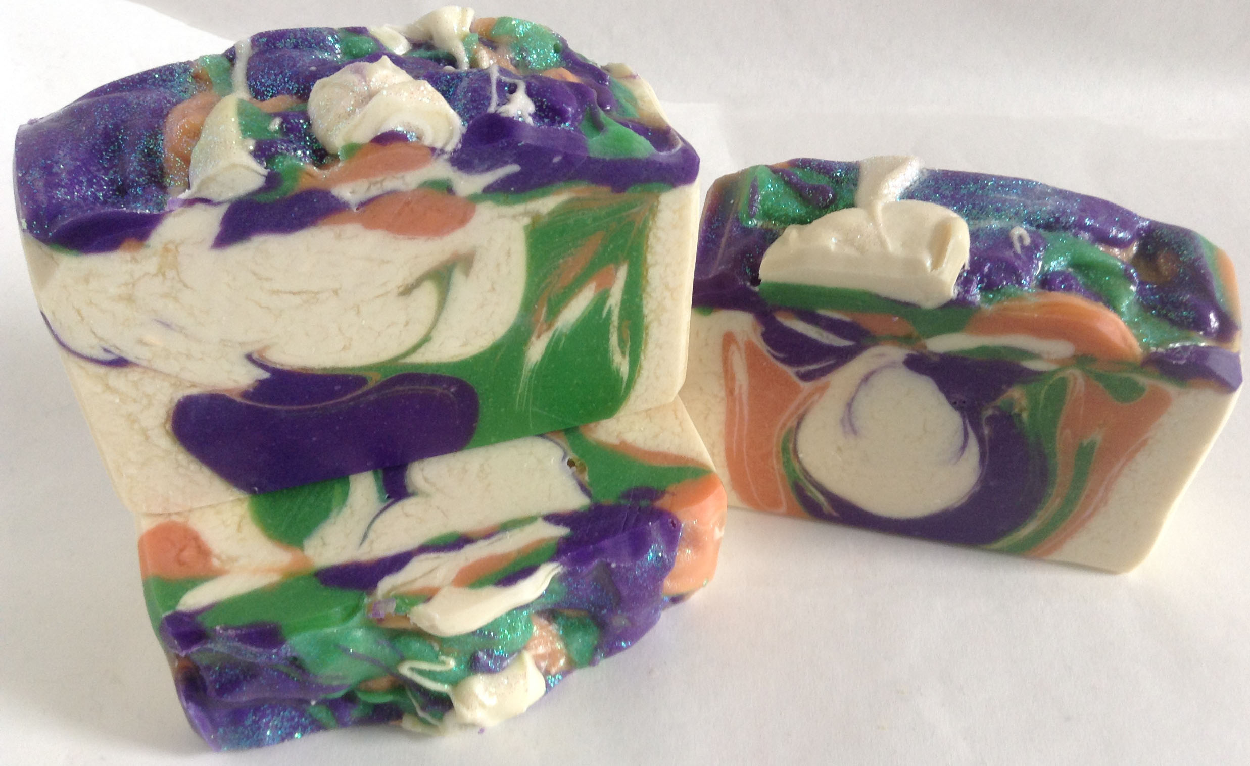
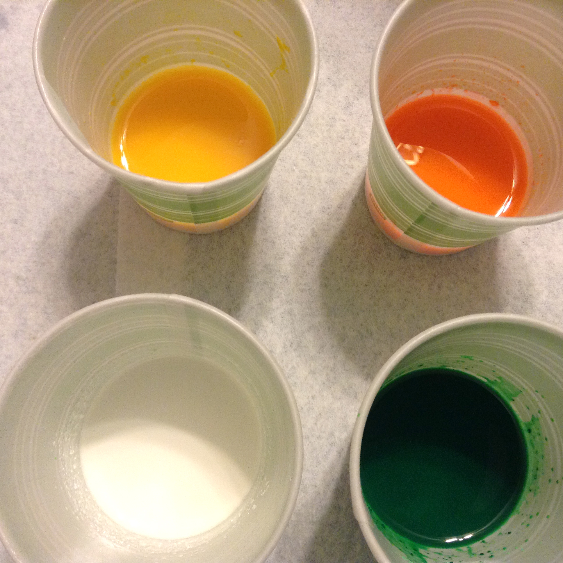
The beautiful oranges, pinks, purples and yellows could work well with this fragrance, and pops of white could help bring the whole look together.

The first thing I did was make an orange embed to represent the setting sun. I neglected to take a photo of it.

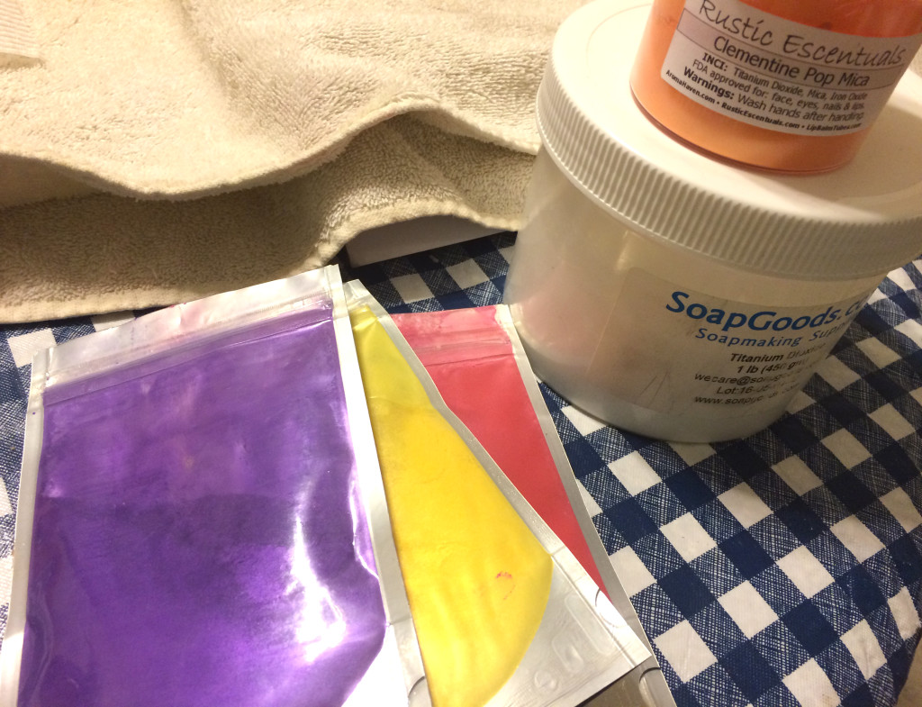
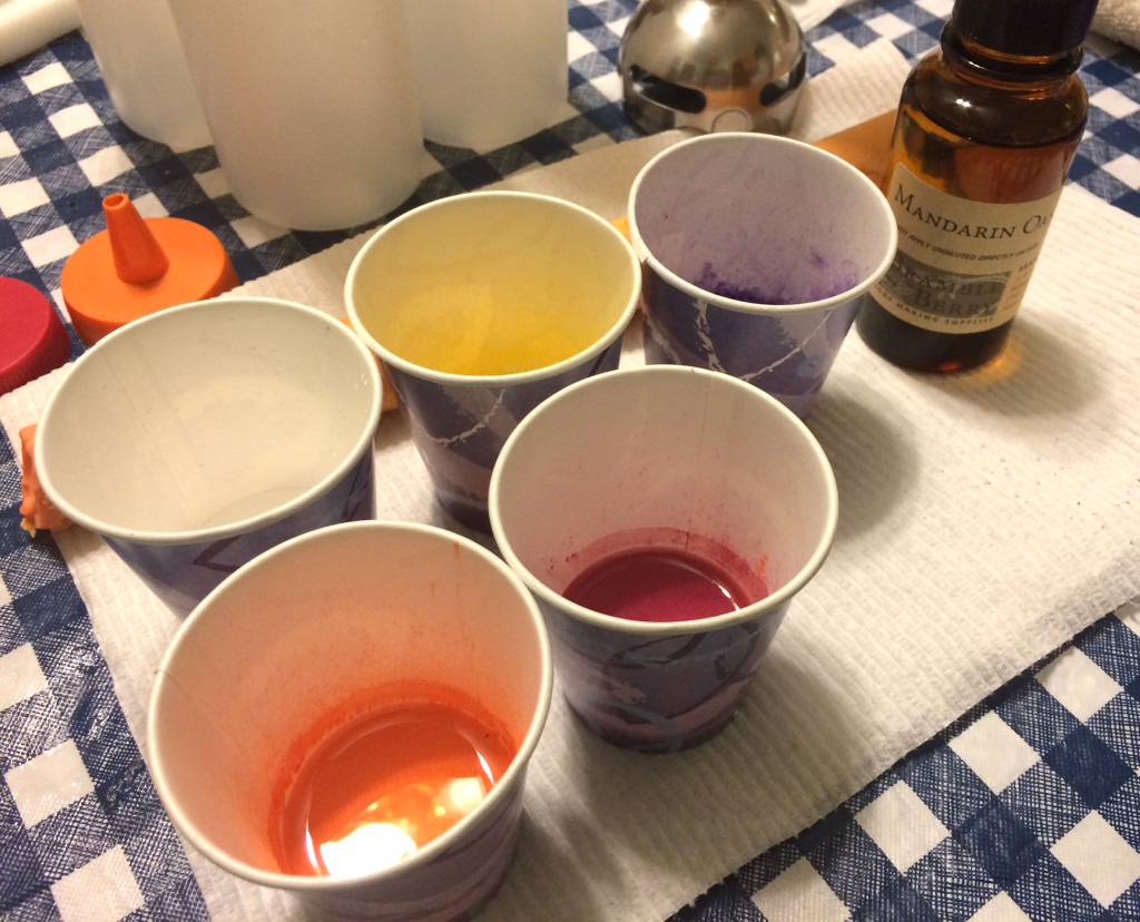
I put together my colorants: Rustic Escentuals’s Clementine Pop Mica, Nurture’s Purple Vibrance, Yellow Vibrance, and Pink Vibrance, and titanium dioxide.

Colorants

I mixed the colorants up and decided to use squeeze bottles to make a layered design. I would not do this again. The soap set up a little bit fast, perhaps because of the floral notes in this fragrance or perhaps because of my recipe, but it was very difficult to squeeze by the end.

Mixed Colorants

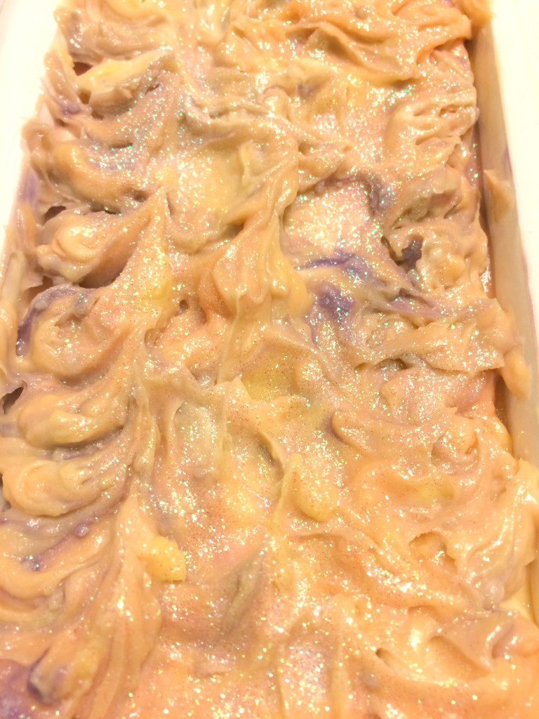
I attempted to create a video of the process, but it wound up being too long and difficult to capture. I took a picture of the top before I put the soap to bed, but the lighting was not too good by that time (it was after 10:00 PM).

Top of Mandarin Oasis

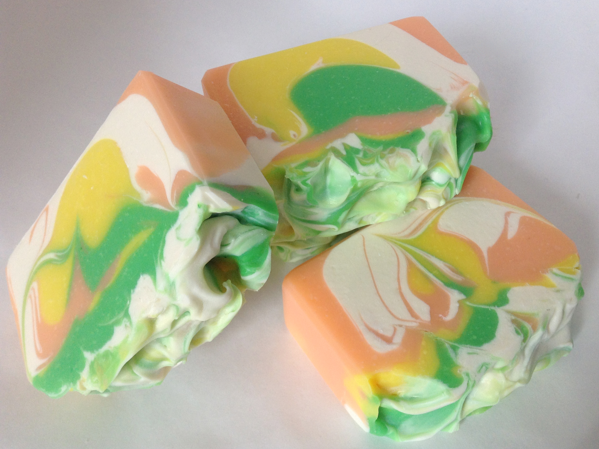
The next day, I cut the soap. Given how it set up, I was happy with how it turned out.

Mandarin Oasis

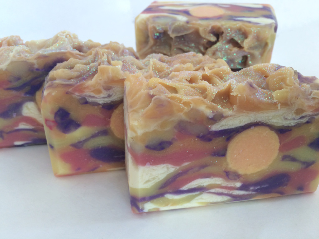
It doesn’t look precisely like a sunset. It reminds me more of an impressionist painting of a sunset. Perhaps you can see the glycerine rivers in the titanium dioxide. I think sometimes this look suits better than a solid white, and in this case, I’m happy they happened. They look a little bit more like wispy clouds than they might otherwise have done.

If I were to do this soap again, same colors and all, I might try to use a spoon to create the same effect, as the squeeze bottles proved difficult to use, especially by the end. Truth be told, I’m not a huge fan of using squeeze bottles in soap designs because they are terribly difficult to clean. I thought they might be faster than using a spoon, but I’m not so sure. I took about two hours to make this soap from start to clean-up. It wouldn’t look exactly the same if I had used a spoon.

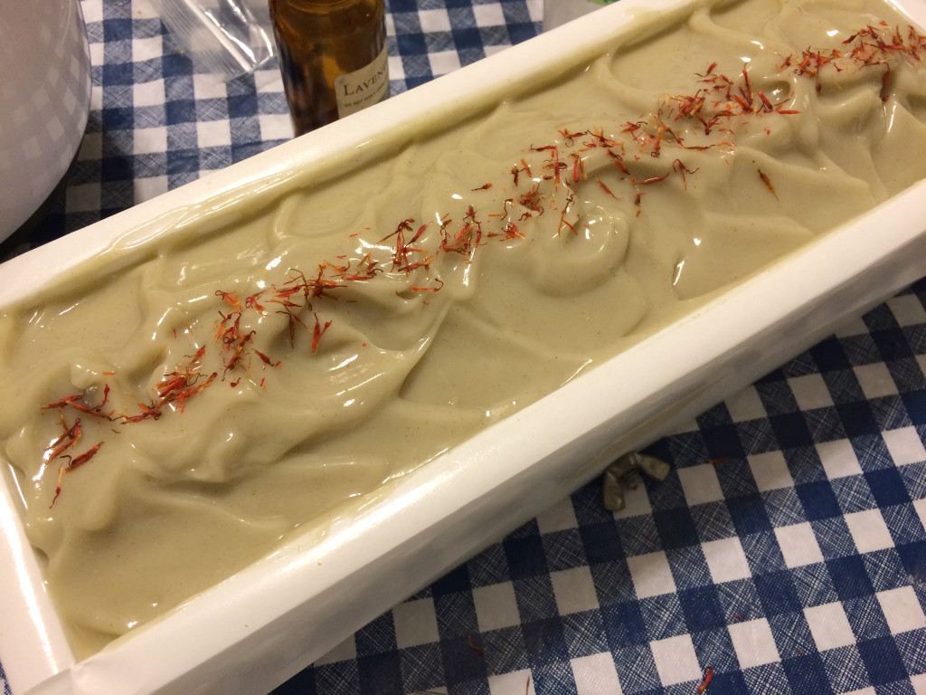
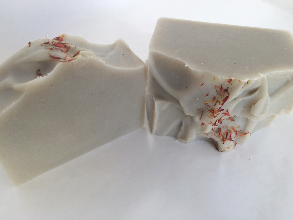
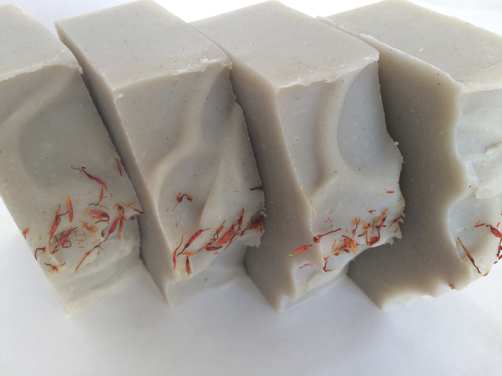
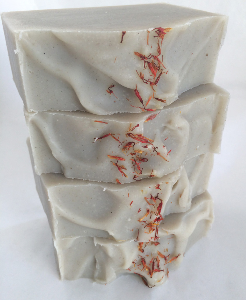
On a less complicated note, when a wholesale customer of mine asked for Green Tea & Cucumber, it seemed like a no-brainer to create a soap with a subtle green hue, much the same shade as cucumber flesh. How to get that hue, however? Chromium green oxide might have been a good choice, but it tends toward a moss hue. I wasn’t sure I wanted to use a mica either, as they tend to be more vibrant, and I needed something subtle. Hydrated chromium green oxide is not quite as dark as chromium green oxide, and it has a teal note to it that I thought might work well. The trick is to use just a scant amount. I think I may have used less than 1/8 teaspoon to color this whole batch.

Green Tea & Cucumber

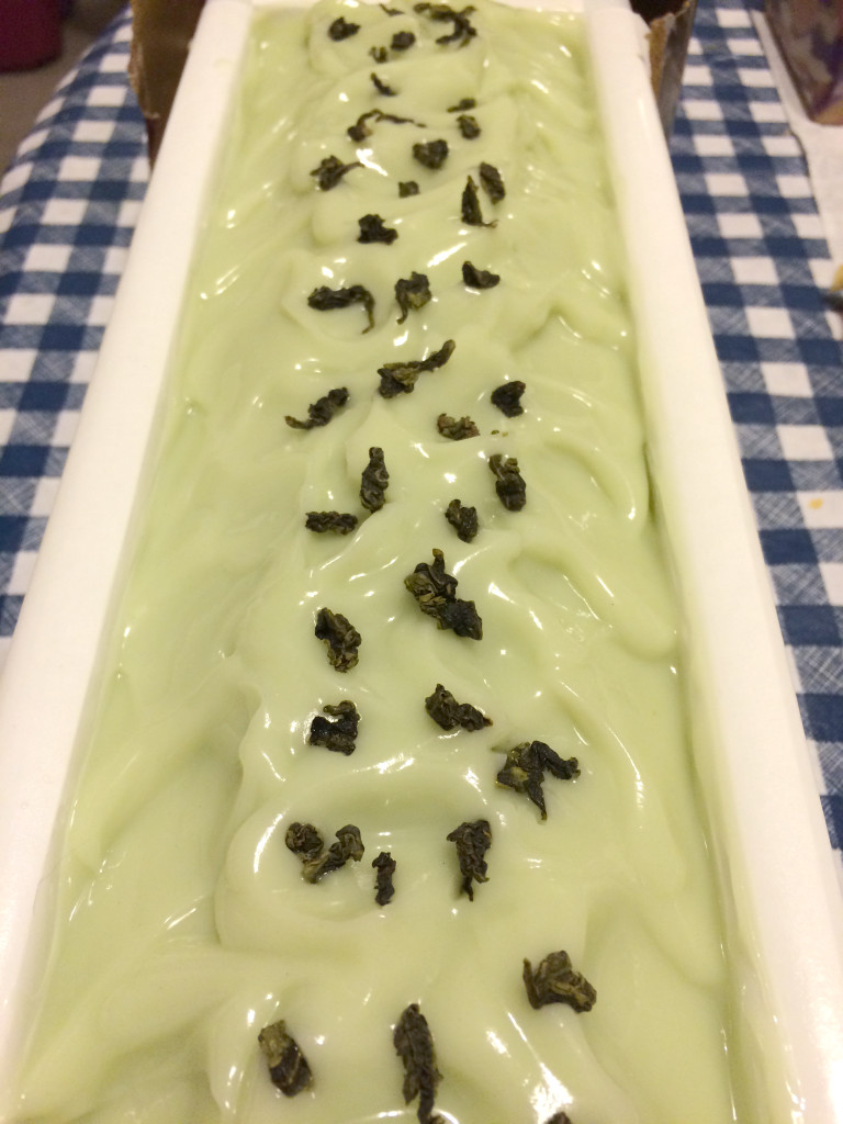
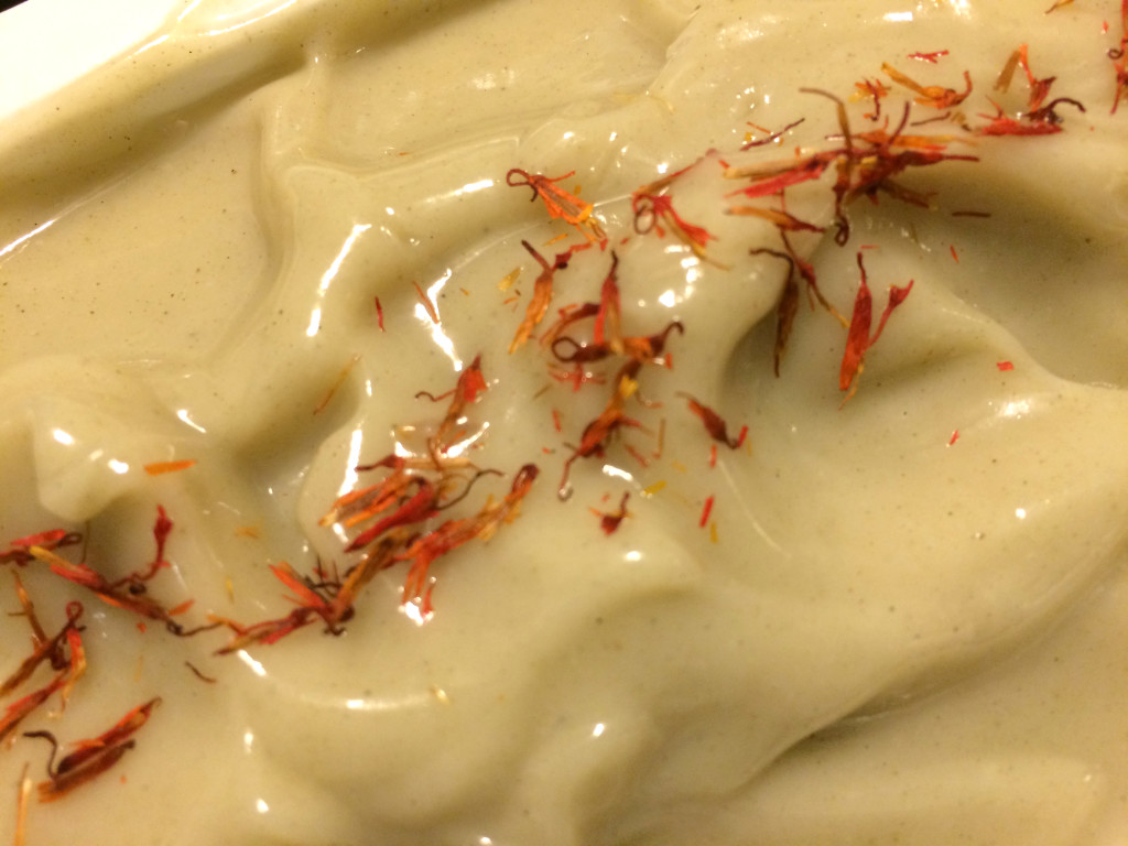
The pureed cucumber in this recipe may also have contributed to the green shade, but it’s mostly the hydrated chromium green oxide because cucumber alone (unless you include the peel) will not result in even this much color. The leaves on top are Chinese green tea leaves—the green tea was a gift from one of my Chinese students. I didn’t think she’d mind if I sacrificed a little bit of the tea for soap. This one hasn’t gelled yet, so I’m not sure what the final color will be, but I don’t think it will stray much from this light, cool green. If anything, it might pick up some yellowish undertones, similar to the color of green tea. It’s exactly the shade of green I wanted, and it complements the fresh green scent of of the Green Tea & Cucumber fragrance oil I used:

This fragrance smells just like freshly steeped green tea with a hint of cucumber. It isn’t your typical sweet cucumber fragrance. The earthy green tea is the most upfront aroma in this fragrance oil giving cosmetic products a fresh and clean scent.

The beautiful thing about soap is that you can use whatever fragrances and scents you want, and you can match colors with fragrances, or you can use whatever colors you want with fragrances.

What do you do? Do you try to match colors with scents? If you have tips, feel free to share in the comments.


Experimenting with Australian Washed Blue Clay

I have admired the way soaps made with Cambrian blue clay look for some time. Once when placing an order with one of my vendors, I decided on a whim to purchase some Australian washed blue clay, thinking it was the same thing as Cambrian blue.

As it turns out, it’s not. After doing some research, I discovered that Australian washed blue clay is actually a kind of bentonite clay. I have used bentonite clay before in shaving soaps because it adds slip, but I hadn’t tried it in a regular soap before. I know that it’s considered to be good for acne, but I decided it was probably fine since I have used a bentonite-clay based shaving soap on my legs and suffered no dryness as a result.

Australian Washed Blue Clay

I’m not sure if everyone sells Cambrian blue clay wet, but Bramble Berry does. Obviously, my Australian washed blue clay is dry. I thought it looked sort of green, but it’s hard to tell with clay until you get it wet, and even then, it doesn’t always look the same as it will in soap.

I decided I would experiment with it anyway because even if it turned out green, that would work just fine with my planned batch. I had decided to use the Lavender & Cedar fragrance oil that Bramble Berry sent me as a thank you for participating in the S.O.A.P. Panel last year. I haven’t seen too many people talking about this fragrance in soaping circles (or perhaps I’m not looking in the right places, which is entirely probable). Bramble Berry does warn that the fragrance loses some of its camphor notes in cold process, which suits me fine. I also thought that it would work well with either a green or a blue soap, so it would be perfect for my experiment with Australian washed blue clay.

I use kaolin clay in most of my soaps because it adds silkiness and creaminess and also helps anchor fragrances so they stick better. French green clay is a staple of my Provence soap. I have used pink rose clay (a form of kaolin) to color some soaps as well, and I have used rhassoul clay in my Guinness Beer soaps. I almost always just add my clay directly to my oils and stick blend before adding my lye. I have had the fewest number of problems with mixing when I have followed this method for using clay.

Another method includes adding clay to the lye water (which you would also only do if you were coloring the soap with the clay only). I have never tried adding it to my lye water.

A third method involves making a slurry with clay and water or clay and oils. I have sometimes had clumps in my clay when I have used this last method, especially if I make a slurry and then add it to a bit of the soap, and then add the colored soap to the rest of the batch and blended as David Fisher describes here. I have had the best luck with this method if I just treat the clay like any other colorant and add the oil or water and clay slurry directly to the soap and blend. If you are doing a swirl or using other colors, it’s the method to try.

Since my Lavender & Cedar soap was going to be one color, I decided to add the clay to the oils and blend. It definitely looked green, but the final test would be adding the lye water and blending. Sometimes the color of the soap lightens once the lye is blended well with the oils.Blending the Soap
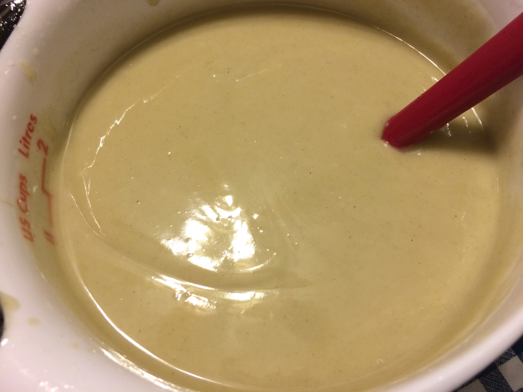
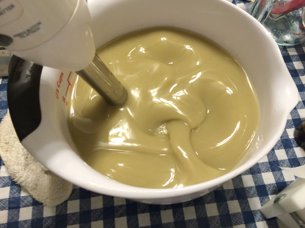
In the early blending stages, it looked a lot like French green clay to me. Once I was done blending, sure enough, it was still green.

Blended Soap

It’s pretty, but it’s sure not blue. I poured the soap into the mold.

Blue Clay Soap in the Mold

I decided to sculpt the tops a bit and add some pretty safflower petals.

Blue Clay Soap in the Mold

Here is a close-up:

Close-Up of Blue Clay Soap

In the close-up, you can see the soap has tiny flecks in it. Neither bentonite or French green clay does that (at least in my experience), and I really like the look of it. It’s not quite the same shade as French green clay, but it’s not far off. The safflower petals set it off nicely, but they would also have looked nice with a blue soap.

I would just have to wait for the unmolding and cutting to see what the soap would ultimately look like. So what happened in the end?

Lavender & Cedar Soap

A lovely shade of green. Definitely nothing remotely close to a blue. For the record, I gelled these soaps, too, so if it were likely to morph or change color at all, it would have done so.

Lavender & Cedar Soap

The real shame here is that you can’t smell them, looking at them on your computer screen. Oh my, do they smell good. A nice scent of cedar underlaid with the floral lavender and some other more complex woodsy notes I can’t quite pick out. Ultimately, I think the color is perfect for the fragrance.

Lavender & Cedar Soap

It doesn’t quite look like French green clay, either. The flecks in the soap are quite pretty, and the color does look nice with the safflower petals. The soaps have a nice, silky feel.

Even though the results of my experiment were not what I had anticipated (a blue soap along the shades of a Cambrian blue clay), I’m still quite happy with them. I love the fragrance, and really hope my customers enjoy the soaps.

Soaping on the Color Wheel

Some time back, I blogged about color theory as it related to selecting colors for soapmaking. In that post, I discussed that one way to create an appealing color combination is to use complementary colors, or colors that oppose each other on the color wheel.

Color Wheel
Color Wheel via Wikipedia

You can see that purple and yellow directly oppose each other on the color wheel. However, orange and green also oppose purple on the color wheel and form a triangulation of complementary colors. In between purple and green (the darker green), there are three colors, and in between purple and orange (the lighter orange), there are likewise three colors. There are again three colors between orange and green. These sorts of triangulations are also worth considering when you are thinking about color combinations.

Color Wheel TriangulationThis sounds interesting in theory, but in practice, how do these colors look together in soap?

I recently made a batch of Autumn Fig Harvest, with a new fragrance from Bramble Berry (which I tested as part of the S.O.A.P. Panel). One of the first things I do if I am not sure what kind of color combination I might want to try is look for images using Google Image Search. I simply Googled the fragrance oil name, and this is the set of images that I could see (screen-captured because of the changing nature of the Internet):

Screen Shot of Google Image SearchThe images in the top and middle rows caught my eye. The first two images in row one are straight from Bramble Berry’s site. The third image, however, comes from a cooking blog called Figs, Bay & Wine. Notice the green and purple in the plums. As I said in my earlier post about color theory, turning to nature for color combinations is often a good idea because nature understands color theory. Finding that picture was a lucky accident because I was not searching for plums at all. Skipping over the fourth picture, notice the third image is a pumpkin in a fall setting. My eye was drawn to how these colors looked next to each other: purple, green, and orange. Even though those colors (with the exception perhaps of purple) have little to do with figs, I knew I had found the color combination I wanted to use.

Celine Blacow has said in her soapmaking videos that using white is often what brings a color combination together. I have noticed the difference white makes in pulling together the look of a soap. It’s not always necessary, but it often does make a huge difference in the soap’s design. So, a field of white would be important in pulling together a design with purple, orange, and green. I thought the three colors would have an autumnal look as well.

Purple can be tricky in soap if you just use oxides, but I had recently purchased a set of Vibrance Micas from Nurture Soap Supplies. I used the Vibrance Purple and Green micas, and I probably could have used the Vibrance Orange from this set as well, but elected to use Clementine Pop Mica from Rustic Escentuals. I had used it before, and I knew it would make a nice pumpkin shade in the soap.

Here is what the soap looked like in the mold.

Autumn Fig Harvest in the moldFirst I poured in a layer of white, then I did a drop swirl with each of the other three colors. I decided to try the spatter-top technique (a sort of Jackson Pollock effect). Just like using white, I have found that a bit of glitter also adds something extra special to soap.

Here is what the soap looks like cut:

Autumn Fig HarvestYou will notice I have a bit of titanium dioxide crackle, also known as glycerine rivers, in the soap in the white parts. There are many intriguing theories about what causes them—the most recent interesting one I came across is the amount of water used in the lye solution—but frankly, I haven’t been able to figure out why they happen sometimes and don’t other times. I believe them to be the result of heat because when I do not gel my soaps, I never have them. However, gelling soaps produces more vibrant colors and allows soaps to be cut and eventually used earlier than non-gelled soaps, and when I can, I try to gel them. Actually, the TD crackle is an interesting look. I’m sure other soapmakers see these soaps and think of them as mistakes, but the sort of antique look of TD crackle can lend interest (of course, that’s also just my opinion, and I’ve stopped trying to fight it).

The colors do look nice together. They make a bold statement, perhaps because they are triangulating colors. Try moving the triangle around the color wheel to come up with other bold combinations: red, yellow, and blue; violet-red (cranberry), orange-yellow, and light blue. In each case, the combination is a striking mix of complementary colors.

Another combination of colors to try is the square.

Square PaletteAgain, a striking combination of colors. In the example above, orange, yellow-green (lime), blue, and violet-red (cranberry). Each of the colors is two apart, which sets them off a little more than analogous colors (think red, yellow, and orange as analogous) would do. Try moving the square around the wheel to create other combinations.

Playing with color combinations using the color wheel can help you create appealing soap color combinations. Have you used the color wheel in your soaping creations? What were the results? How do you decide what colors to use? Chime in the comments!

Selecting Colorants for Soap: Color Theory

When selecting colors for soapmaking, consideration of color theory as it applies to design might help you achieve the design results you want. Color theory is the notion that certain colors complement one another and make for a more pleasing design. A practical example of complementary colors can be seen in Vincent Van Gogh’s famous painting, The Starry Night. The Starry NightThe cool blues complement the warm yellows of the stars, but the fresh greens also look beautiful with the cool blues. Van Gogh wrote to Anthon van Rappard:

[T]he great question occupied me—colour. I mean the breaking of the colours, red with green, blue with orange, yellow with violet. Always how the complementary colours go together, their influence on each other. Of which nature is as full as of light and shade.

Yet another letter to his brother Theo dated October 20, 1885 shows how deeply Van Gogh was thinking about color. That whole letter is worth reading if you are interested in color theory. We are drawn to color schemes based on how well the colors work with one another. In the color wheel below, warmer colors, like reds, oranges, and yellows, appear on the top, while cool colors like greens, blues, and purples appear on the bottom.

Color Wheel
Color Wheel via Wikipedia

Complementary colors oppose each other on the color wheel. For example, notice that red and green oppose each other on the color wheel. They are often thrown together, particularly as Christmas colors. Blue and orange also oppose one another, as do yellow and purple. Let’s take one of these pairs and look at it in nature:

Viola tricolor pansy via Wikipedia

Nature seems to know well which colors will complement one another. Can’t you picture the yellow, purple, and green, perhaps with some white added in for contrast, in a gorgeous soap? In fact, one thing I often do when designing a soap is turn to nature photographs for inspiration. Another color scheme that often works well is to use analogous colors together. Analogous colors are those colors that are adjacent to each other on the color wheel. For example, red, orange, and yellow are analogous warm colors. Combining these colors together might evoke images such as fire or even summer fruits. However, colors look very different when they are placed next to other neutral colors, such as black or white. What might that fiery combination of red, orange, and yellow look like with a swirl of black woven through it? What about white? Here is a soap in which I tried a combination of the warm colors of red and orange with white.

Cranberry Blood Orange

One soapmaker who really gets this concept is Celine Blacow of iamhandmade.com. I have watched her videos for over a year now, and I have never seen her pick colors that do not go well together. Any soapmaker who is interested in learning to use colors well should definitely check out her work. Celine often uses a bit of white to great effect in her soaps. She said recently, and I confess I can’t recall in which video, that she adds white to set off the colors. Even a little pop of white can make a huge difference in the look of the soap. In his letter to Theo (linked above), Vincent Van Gogh said:

No—black and white, they have their reason and significance, and anyone who suppresses them won’t get it right. The most logical, certainly, is to regard them both as—neutral.

I recently made Mango Papaya Soap, and in selecting the colors, I turned to photographs of mangoes and papayas.

Mango
Image credit Fir0002/Flagstaffotos
Papaya
Ripe papaya via Wikipedia

The colors that jumped out me were the oranges, yellows, and greens of the leaves. While there is no white in the fruits themselves, notice that the backgrounds include white, so I decided that when I colored my soap, I’d use white to make these other colors pop. ColorantsHere is the soap that resulted. Mango Papaya SoapThe colors hearken back to the nature photos of mangoes and papayas. If I make it again, I’ll use less green and more orange, but I’m happy with the results, and the colors work well with the mango papaya fragrance I used. I am not sure this soap would be as nice without the white. Colors used in this soap are titanium dioxide, Bramble Berry’s Fizzy Lemonade and Tangerine Wow pigments, and TKB’s Reformulated Neon Green.

Sweet Jane

I have been watching Celine Blacow’s instructional videos, and I can’t think of anyone else I’ve seen who is half as good at explaining how to swirl. She does many different swirling techniques, including the hanger swirl, which I’m dying to try—unfortunately, I don’t have any hangers. Well, that’s not true. I have a bunch of plastic ones I can’t bend. A co-worker said he’d donate a bunch to me. I’m looking forward to trying it out.

Here is Celine’s tutorial:

I ordered a few new colorants from Bramble Berry and did a successful in-the-pot swirl with three colors (Fizzy Lemonade, Ultramarine Violet Oxide, and Hydrated Chrome Green pigments) in a shampoo bar recipe with tea tree oil. Those bars are still very soft, but I’ll post a picture soon.

After trying it once, I decided to do another, but I wasn’t sure what I wanted to do. I realized I still had some Lemon Verbena fragrance oil from Bramble Berry, so I decided to do a coconut-milk based soap using the Fizzy Lemonade pigment and Lemon Verbena fragrance. I’m calling it Sweet Jane after Jane Bennet in Pride and Prejudice. Jane Austen’s classic novel celebrates its 200th anniversary on January 28, 2013! Anna Quindlen once describe Jane Bennet as “sugar to Elizabeth’s lemonade.” She always looks for the best in everyone. Here she is as portrayed by Rosamund Pike in the 2005 version of the film (she’s the blond).

The Bennet Sisters
From left to right: Lydia, Kitty, Lizzie, Jane, and Mary

Jane refrains from judgment. She’s quiet and serene. Lemon Verbena is a perfect complement to her sweetness of character. I imagine she smells exactly like Lemon Verbena. And the yellow not only complements the soap fragrance, but also alludes to Jane’s hair color, believed to be blonde. Jane wrote in a letter to her sister Cassandra:

Henry & I went to the Exhibition in Spring Gardens. It is not thought a good collection, but I was very well pleased—particularly (pray tell Fanny) with a small portrait of Mrs. Bingley, excessively like her. I went in hopes of seeing one of her Sister, but there was no Mrs. Darcy;—perhaps however, I may find her in the Great Exhibition which we shall go to, if we have time;—I have no chance of her in the collection of Sir Joshua Reynolds’s Paintings which is now shewing in Pall Mall, & which we are also to visit.—Mrs. Bingley’s is exactly herself, size, shaped face, features & sweetness; there never was a greater likeness. She is dressed in a white gown, with green ornaments, which convinces me of what I had always supposed, that green was a favourite colour with her. I dare say Mrs. D. will be in Yellow.

Martha Rainbolt argues in a 1988 English Language article entitled “The Likeness of Austen’s Jane Bennet: Huet-Villiers’ ‘Portrait of Mrs. Q” that this image may be the one Jane Austen saw:

Portrait of Mrs. QSeems logical to me based on the evidence I’ve seen. She’s a very sweet-faced lady.

Doesn’t she look like she’d wear Lemon Verbena?

I’m not sure what I’m going to get with this soap. My experience with the Fizzy Lemonade colorant is that it doesn’t look like it has changed color at all when you add it to the soap batter, but after it has saponified, it is a very pretty yellow. Right now, it just looks yellow. Who knows what will happen when I cut it? I’ll post the cutting pictures tomorrow.

For the interested, here is the recipe:

  • 30% olive oil
  • 25% coconut oil
  • 25% palm oil
  • 10% sweet almond oil
  • 5% cocoa butter
  • 5% castor oil

By the way, in case you were wondering, yes, I will be making a soap for each of the major characters in Pride and Prejudice this year.

Amy Lowell’s Lilac Soap

Amy Lowell
Amy Lowell via The Poetry Foundation

Amy Lowell is a Massachusetts poet. She loved the return of lilacs to New England in the spring and wrote a beautiful poem about it. I love lilacs, too. My grandmother had a lilac bush in her back yard. They were beautiful and smelled heavenly.

I tried yet another experiment this weekend: lilac soap. Who better to name a New England lilac soap after than Amy Lowell? I had intended to try swirling two colors for the first time, but things didn’t quite work out as I had planned.

Ingredients:

  • 8 oz. olive oil
  • 8 oz. coconut oil
  • 12 oz. palm oil
  • 12 oz. coconut oil
  • 13.2 oz. distilled water
  • 5.472 oz. lye
  • 4 T lilac fragrance oil
  • 2 T alkanet powder

Right about Tuesday of this week, I measured out two tablespoons of alkanet powder and 4 oz. of olive oil into a plastic container, stirred well, and put a lid on the container. I put the alkanet and olive oil infusion in a dark cabinet. I took it out today to use with my lilac swirl soap, intending to make two small batches of soap in different colors. I mixed the oils for each of the colors at the same time, measuring out half of the required amount. I put the infused olive oil in my colored bowl so I could remember which batch was supposed to be colored. In case you were wondering, yes, the alkanet infusion stained the plastic, but it didn’t bother me much because I wasn’t trying to prevent staining. If you use colorants and don’t want to stain your plastic, just use a glass jar for infusing instead.

Alkanet InfusionIt was a little scary to clean up afterward. Perhaps it might be best after all just to use something you can dispose of, like a pickle jar.

I had problems with my lye being too hot again, and this time, I was just using distilled water. The common denominator seems to be the lye, which is a new brand. I think I just won’t buy it again once I’ve used it up. It’s too much of a hassle to put my lye in an ice bath every single time I want to make soap. I would expect it when I’m making milk-based soaps, but not water. The lye I bought from Bramble Berry the first time I made soap costs about the same amount, even factoring in shipping, so I will just be ordering it from them.

I mixed the batch without the alkanet first so that I wouldn’t mix colorant from the hand blender into the light mix. I poured 2 T of lilac fragrance oil into each small batch of soap. The trace was too thick when I tried to pour the soap. The lilac fragrance oil accelerated the trace. At any rate, it was all I could do to spoon out globs of the soap into my mold before it hardened too much to use. I had no idea what I was going to get when I cut it open, but I think that’s true whether you spoon it out or swirl it, especially the first time. I just smashed it into mold as quickly as I could and hoped when I cut it the next day all would be well.

Well, I can say this: it could have been worse. I at least have usable soap, even though it isn’t very pretty.

Lilac SoapWhere to begin? Well, the light color is really not very pretty at all, and I suspect that its yellowish tinge comes from the shea butter I used. It actually looks prettier in these photos than it does in person. Trust me. It’s kind of a gross yellow.

Given that the color isn’t very pretty, I wish I had just colored the whole batch purple. Live and learn. As a result of trying to do too much (swirl, in this case), I wound up having the soap seize up on me, and I desperately shoved the soap into the mold, but pockets formed where there was no soap, and it was really ugly when I cut the bars.

Lilac Soap
Look at that nasty air pocket!

I suppose everyone has a batch of soap seize up on them at least once, but at least now I know that working with the lilac fragrance oil is going to be tricky, and I will need to bring my temperatures down a little to slow down the time it takes to trace and add the fragrance at a lighter trace. I also learned that swirling is really hard with floral fragrance like lilac, so I may just need to make the soap one solid purple color instead.

Lilac Soap

I also had some problems with soda ash, which is probably because it seized up, and I wasn’t able to put it to bed as soon as I should have. I had to cut the bars down quite a bit to make them somewhat presentable, as most of them had air pockets on the sides where the soap globs didn’t mash together well.

The soap smells heavenly, just like my grandmother’s lilacs, and I tried lathering up with some of the cuttings as a test. The lather is smooth and creamy. The soap has cosmetic issues to be sure, but it is something that could be used, even if I don’t think I could give it away or sell it (unless I discounted it like those outlet stores do with clothes that have something wrong with them).

I’m sorry, Amy! Next time your soap will be worthy of your name!

Creative Commons License

Amy Lowell’s Lilac Soap by Dana Huff is licensed under a Creative Commons Attribution-NonCommercial 3.0 Unported License.
Permissions beyond the scope of this license may be available at Suds Life: About.